Z1 Branding — Portfolio

We rebranded our studio to capture the new path we walk with our digital products.
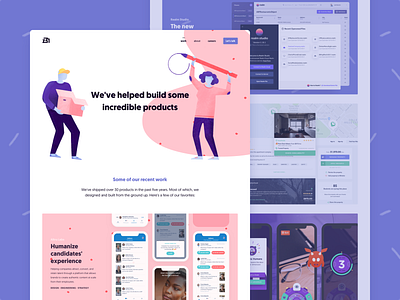
We created a whole world around our philosophy and way of understanding the projects. For that reason, to build the new website we included lots of organic and curved forms that would contrast with the strict geometry of the Z1 logo.
Not only that, but sinuous forms would also contrast with the geomanist typography we inherited from our previous brand Commite (which is a particular homage to our beginnings). We added pastel colors, textures, volumes and characters to get the handmade and human touch that is involved with the creation of any product.
Each illustration has a function and represents something: people are in action either thinking an idea, drawing a prototype or delivering an object; figures symbolize the different parts of a prototype and plots different materials.
Case study on Medium!
Follow Z1:
Instagram | Twitter | Github | LinkedIn