Slack Redesign
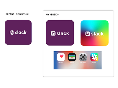
I made my version of a quick Slack branding redesign. I brought back the essential hashtag shape, and integrated a subtle chat bubble shape in the counter of the hashtag. I perpetuated the new color pallet but using a gradient scheme that seems less flat and corporate than the one color layouts in the original rebrand. I feel that the shape and color scheme retain the well-known branding of Slack while still refreshing the overall look and feel. What do you think?
Typeface: Overpass
