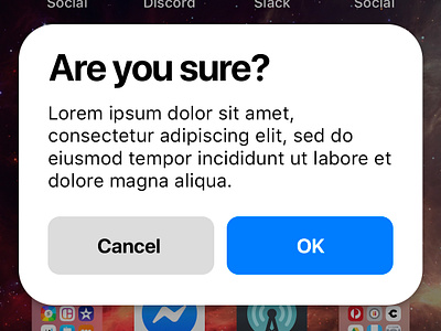
iOS Modern Modal Dialog
This idea's been rolling around in my head for a while, so I thought I'd mock it out in Photoshop real quick.
The system modal dialog on iOS, with its centered text and very small font sizes feels very outdated to me now.
If Apple was going to overhaul all of the iOS UI components to match the new design language they brought in with Apple Music and the App Store, I would imagine it would look something like this. :)
More by Tim Oliver View profile
Like

