Type Change
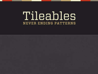
Looking at the Archer version, especially the tagline, I could see anti-aliasing issues at the smaller size so I've swapped it out for Vitesse which looks a lot crisper around the edges.
What do you think?

Looking at the Archer version, especially the tagline, I could see anti-aliasing issues at the smaller size so I've swapped it out for Vitesse which looks a lot crisper around the edges.
What do you think?