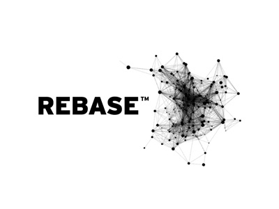
Rb Logo Design
One of a few preliminary ideas for a new client.
The client is innovating a new form of database product/application, and is therefore seeking a logo and identity to go with the software.
There are way too many features, aspects of Rebase to include in one logo, but some keywords are: flexibility, new thinking, expansion, audit, reactivity, computer science, accessible, local.
A main aspect are 'nodes', which is a fundamental feature/aspect of Rebase, so one line of thinking would be to actually visualize these nodes for the logo.
One can then adapt this identity feature to create 'almost' infinite variations whilst still keeping true to the core logo and identity.
It also allows for various lock-ups (attached some examples) of the logo depending on the shape of the image as well as some nice options for things like stationery, application icon design and other brand touch points. One could use cropped portions of the node visual to create a filled version of the logo type and/or initials as well, so quite a lot of options available.
It's a literal play on the technology, but maybe with some solid typography and careful creation of the visuals it could look quite stunning when applied. So more about the brand as a whole than just the logo, but still hoping 'just' the logo can look awesome.
The typeface is Interstate Black, by Font Bureau.
NB: This actual node image it not of my creation, and is a placeholder only for the concept, but found via Google search. So the final design would feature a unique set of node visuals.


