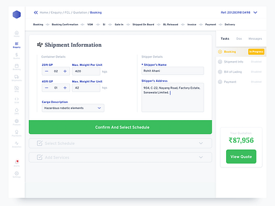
5. Dashboard Booking
This project was the most challenging one for me, technically. I invested a lot of time, which could have been reduced but I did it anyway because it was the first time that I was building a design system from scratch. For a SASS product. A direct competitor to Flexport.
In no way, it is the best solution but I tried to perfect each element down to the 8px Grid:
• Textbox height.
• Form Field.
• Sidebar
• Navigational Elements
• Buttons
• Notification Toasts
• Icon's Bounding Boxes
• Active/Hover/Pressed States.
• Page Elements
• Components
In hindsight, I could have done this much later on, and some of it wouldn't even have mattered because as I learned recently from my design boss, the text bounding box is out-of-the-picture when it comes to development.
I gnawed a lot of brain time over perfecting the line height for individual sentences and paragraphs.
This particular screen was the crux of the SASS navigation. I wanted a visual step-down approach for people to understand how many steps were left for a task completion.
Along with that, I used the "status" indicators to show which 'section' they were on. In terms of UI, I wanted to show how the light bleeds in and gives way to the center of the dashboard; like a river flowing into an ocean. A somewhat fitting UI approach for a service that does freight and shipping.
I understand that this was overly detailed for a wireframe. Even for a high-fidelity wireframe but I get worried that if I don't solve UI problems in Wireframes, my designs might not be flexible enough to scale when UI phase starts.
