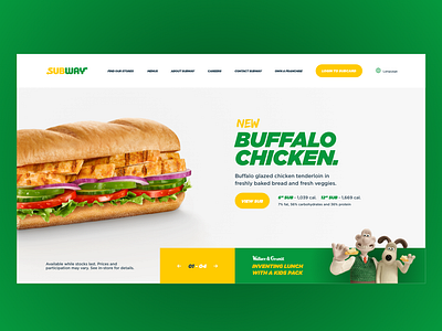
Subway Homepage Redesign
Subway's current homepage is awful! So to this end, I've created my own interpretation of a redesign of Subway's homepage. This new design showcases their sandwiches in a much more visually pleasing manner, with a user-friendly navigation.
Enjoying my work? Click below for more shots from my Dribbble existence. https://dribbble.com/Seraph1611
More by Mike Carney View profile
Like
