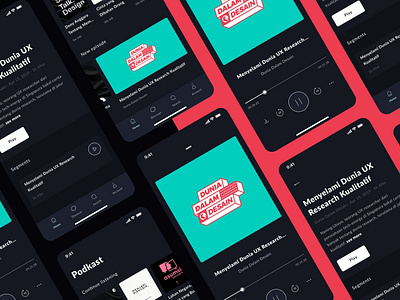
Practice - Podkast, Dark Theme Podcast Mobile App
Hello, this is not a real project, but this is only practice. I don't know why, but when I use a dark theme for an application, it looks really bad. Any ideas why?
So yes, in this practice I made a concept for an application called Podkast, an application for those of you who like to listen to podcasts.
Why did I choose to design a podcast application as a design exercise? There is no specific answer for that, lately I just like listening to podcasts, that's all: D
Some of the steps I made in designing this application:
1. I downloaded several existing podcast apps on the market
2. And I tried the apps one by one
3. Sorting out what I think is very good for the user and what doesn't
4. Improving what makes these app's experiences less good
5. Create an information architecture, what information is usually needed by the user in a podcast app
6. Made several wireframes so it will make me not so confused when I went into digital processes
7. Then continue the design to the digital process (I used Figma btw), make some changes to make it better, and that becomes the design you see right now.
Any ideas or more suggestion? Please leave a comment below, it will really helps me a lot. Thank you very much.
