Bubble Chart


Took a small dataset of ice cream sales by temperature to visualize as an exercise.
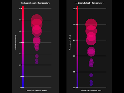
Decided to do an overview of sales by temperature instead of providing exact dollar amounts. This allowed me to play with the visualization of the dollar amounts while still illustrating the main findings, that sales are up when temperatures rise. Data shows, to no surprise, ice cream sales go up when it's hot outside! 😂
Ended up with a vertical bubble chart, bubble size is determined by dollar amount, bubble placement & color are determined by the temperature value.
On the left range of temperature from 0–35 degrees Celsius, right is from 10–35 to give the bubbles more space.
You can see my sketches, original dataset & excel chart in the attachments 👍