Very Simple #NOTE Taking App
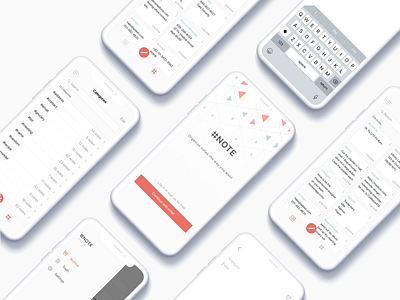
Minimalist design for a note taking app. The app was designed with “less is more” in mind.
Displaying all notes in the grid layout style helps users preview the content without having to click each note. Users can also use their own hashtags to categorize the notes :)
More by Youjin Hwang View profile
Like
