@2x
Following some conversation on Twitter about 2x assets, I thought I'd share a bit about what I do.
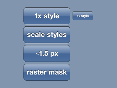
The topmost button shows a direct copy/paste layer style of the 1x asset. On a 2x device, this looks a bit sharp and thin.
The second example illustrates what happens when you "scale styles" in Photoshop if you upres a document. There's a 2px drop shadow, a 2px inner glow... all the styles are exactly doubled. Not the most attractive, though it will look "identical" against a 1x device. The only advantage is that the button corners got smoother (because of the additional pixels) but there's no additional detail given to the edges and in my opinion, it looks clumsy.
The third button is a revised style based on the original 1x but given additional pixels, you can use a 1.5 pixel shadow instead of a harsh 1 or 2 pixel stroke. For the drop shadow (white inset look), I've made the opacity slightly higher, but kept a 1px sharp line. (There's some nifty tricks in here if you've never used Spread, Range or Contours for Glows and Shadows. I recommend you check out some of the settings that I'm using in the Layer Style!)
The fourth exemplifies the third style with smoother corners which are a product of drawing with the marquee tool, four circles and two rectangles, to construct the same shape. Photoshop renders marquee selections smoother (with more levels of opacity) than the vector masks can. While tedious, it results with smoother UI elements. Probably best after you've settled on the design and are kicking out assets. @Philipp Antoni later in the comments shows a great example of the difference http://d.pr/i/bpEl
I hope this helps. It's a little boring, but it may be useful to some of you!
PSD attached, download here.
