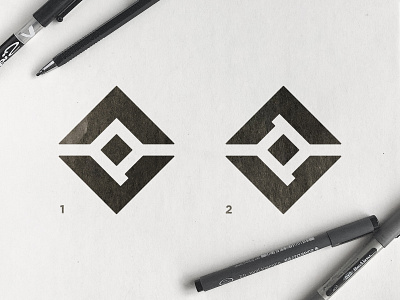
Vatix Protector - Logo Concepts
Some of you may remember the Vatix Logo i created last year... I was happy when i got contacted by Mark again to develop another logo for him, this time for a sub-brand called Vatix Protector.
The focus of Vatix Protector is going to be creating lone worker protection devices - A lone worker is an employee who performs an activity that is carried out in isolation from other workers without close or direct supervision. Such staff may be exposed to risk because there is no-one to assist them and so a risk assessment may be required ⚠️
I aimed for a logomark that first of all included a center element being protected and sheltered, but other than that, the initials V and P. Now, the P is more obvious on the top one, but the bottom one is more symmetrically balanced... Can you help us decide which one is the best?
