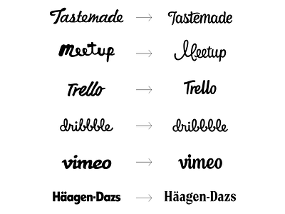
Redesigning known brands challenge
Earlier this year I challenged myself to redesign wordmarks of some already established brands without dropping its brand equity that has already been built over the years.
The new logos are improved both aesthetically and functionally, for example, the new dribbble logotype has larger counters which makes the wordmark more legible at small sizes.
What's your favorite redesign?
The full project with process images at:
Behance - Redesigning Known Brands Challenge
More by Lance View profile
Like
