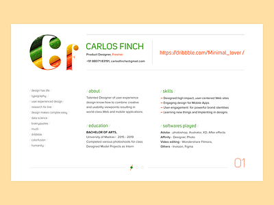
Portfolio aka Personal Website
Hello all,
Good morning, Designed a minimal resume aka portfolio aka website with two color proportion. Navigation has also been provided as one can navigate by scrolling down too. Some basic information are neglected. Just if someone want to have a look I had provide valuable info where the respected person can contact by having his personal number or even by E-mail. Nearby I had provided the Portfolio link where one can see his works or he can also navigate to the second page. the goal is to make design as minimal as possible with strong information. A fresher can also have many skills so why i had provided some strong points on this part. People always value ones education, so i had added education and also his learning. Every people have different perspective on a design. Your feed backs are always welcomed. Keep learning... Dont forget to check the attachment. Thanks Have a great day ahead.

