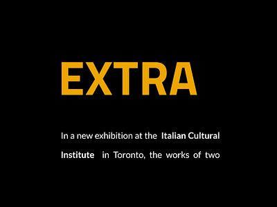
Extra Italian – Font Pairing
The headline contrast font is a bold Titillium Web. This Sans-Serif font is originated in Italy’s Accademia di Belle Arti di Urbino not far from Rimini. It's paired with more regular Lato.
For true Italian architecture vibe, I've used a minimalistic picture of Reggio Emilia AV Mediopadana high-speed railway station. The station is located on the Milan–Bologna high-speed railway.
The retro option of the same idea was created with The Man from U.N.C.L.E. color scheme in mind. For the first experience, I like it a lot!
Full Project on Behance: https://is.gd/Pfjl09
More by Tony Filonov View profile
Like

