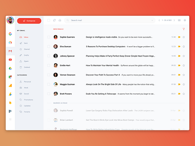
Gmail Redesign - Invision Studio - Uplabs Challenge
Google has so many different products and it's always a pain to navigate through it all. There are bookmarks sure, but I find myself constantly typing domain names in the address bar. I never use the little app navigator on the top right, and it's not smart enough to display my most used Google products.
So, that is the reason behind the 'left app bar' on the design. It's purpose is to be smart and know exactly what you use based on your recent activities.
The rest is just a redesign of what you already use.
Cheers!
More by Shahen Algoo View profile
Like
