Google Drive Redesign
A brand new @Google Drive interface ⚡️
For the past few days, I've been studying Google Drive to recognize some of it's pain points in terms of the UX. I tried to approach them through a layout overhaul, keeping its memorable design, but tweaking a few things to improve its experience. On Twitter - https://twitter.com/alyssaxuu/status/1121802682900144130
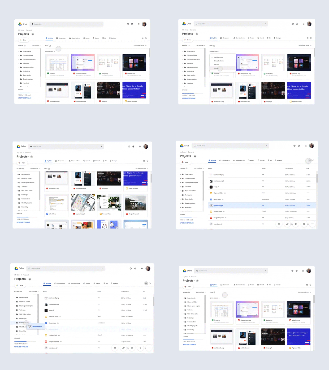
🔍 I moved the navigation from the left to the top, making it feel more natural, visible, & less cluttered.
👀 The name of the folder you're at can be seen more easily on the top left, which is unaltered by its path, now moved over it.
📁 Folders have been entirely removed from the content view, giving you direct access to your files (w/o having to scroll past them)...
👈 ...& encouraging the user to move files to the sidebar, where they are sticked & visible at all times. They also can be sorted & searched for separately.
📌 Quick access is customizable - want to see recent files right away? No problem, just select it in the dropdown. It also has adopted a gallery format to quickly surf through the files.
⚙️ File actions have been moved to the bottom right, so they can easily be noticed by the user.
✨ The "New" button has been placed between the header & body to stand out from the rest.
Hoping to make a full case study with more changes & proposing new features for Google Drive soon!
👋 I am currently open for opportunities, contact me at hi@alyssax.com
