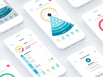
Pillo Healthcare App Screens
We believe that details matter most when speaking about usability of the interface, especially the one of a healthcare app.💊💊💊 When designing screens for Pillo healthcare application, we considered each peculiarity, such as accessibility of tabs, color of icons 🎨 and clarity of titles above them, so that everyone feels free and comfortable when using it — to our point of view, that's what makes the interface topnotch. Do you agree?
If you want to get acquainted with the full description of the interface, check out the link
Press “L” on a keyboard to share some love and follow us if you don’t want to miss our upcoming works!
♥
We add heart to technology.
■
Looking for mobile app design? We are open to new projects! Feel free to drop us a line at ☞ contact@415agency.com


