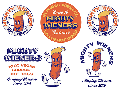
Mighty Wieners
Unused identity for Mighty Wieners
The client was really up for leaning into the double entendre for the word wiener which is just amazing. We wanted something classic in terms of illustration, type and colour.
We have decided to go with a bit of mix of this and the second option which I will share in good time.
More by Aron leah View profile
Like

