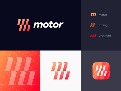
M+M Unused Logo Concept
Hi everybody!
Here's the fourth unapproved logo concept from a recent car related branding project (I've replaced the real brand name with a fictitious one here). The idea is to combine a letter M, a racing flag and a diagram.
This concept was rejected because it lacked the "exchange" metaphor and looked a bit too sports oriented then needed.
Stay tuned for more details from this project. The final approved version is coming soon!
____
Contact me to get your logo design or branding project done: lepisoff@yandex.ru
More by Dmitry Lepisov View profile
Like
