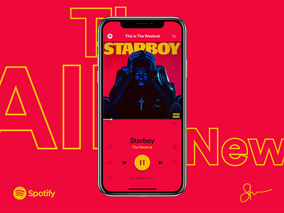
The All New Spotify Redesign
A bolder, more functional vision for Spotify in the new era of music streaming.
—
See more of the concepts
View the design file
Follow me on Twitter, Behance, Uplabs & LinkedIn
—
Design story : Since 2015 when Spotify first unveiled their Brand Refresh and the GLUE design language, it became the key catalyst to their global growth. It is so versatile at that time, it transcends from one of the best user interfaces of a cross-platform app to their music media marketing strategy. It was really ahead of its time.
Here's what happened since 2015: more music streaming global competitors that out-innovated and scaled them, music streaming has grown exponentially, design trends changed and matured, they became too complacent, too comfortable as the top market leader and they recently bet to differentiate on bigger content library with their Original Podcasts pivot.
With all that, but not with a better app user experience that compliments their growing podcast library and it's combined problems.
Here's a critical, modern, rethinking of the Spotify experience.
An evolution, not a revolution. A more cohesive, consistent, expressive and functional Spotify experience, to it's still iconic look.
