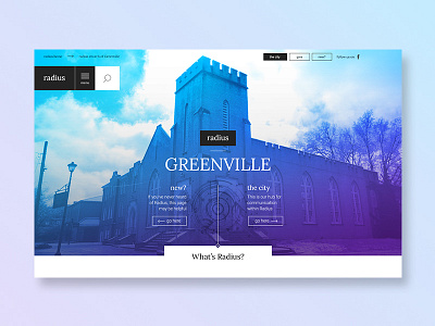
Radius Church - Website Design
Website and logo design I created for a local church some time back. I find that church sites are some of the most outdated ones out there. I played with characteristics of double exposure imagery and gradients for main imagery and more of an editorial layout for their content design.
There were a lot of resources on the site, so making sure the user could easily navigate through the content was essential to this experience. Very few things are worse than having an unorganized site that confuses users as to where things are. Let’s just say this makeover was much more intuitive this time around.
More by Cristian Valdes View profile
Like


