URBAN CHEFS FL
Their vision needed to be a unique one, as they’re both a culinary and consulting group that offers a variety of services. My aim was for their logo to project exactly that.
•
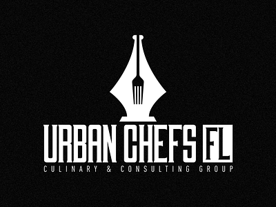
The initial concept was more of a rustic look, but as we played around with the design I had an idea for a different approach. Having the logo convey a serious yet inviting look that displays their consultant AND culinary sides. The pen represents the consulting, and I hope you can figure out what the fork represents. It achieved a unique, classy, approachable look, which I’m happy about. We stumbled but trusted in the process and got a good result. Thanks to @urbanchef_mitch for being such a great client and being willing to trust in that process.
