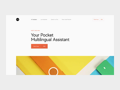
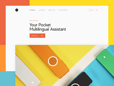
Promo Website Animation for Pocket Multilingual Assistant
Hey there!
Check out a website I created to feature a cool product - a pocket-friendly, AI powered multilingual translation assistant. The product also includes recording and transcription functions to capture your speech and convert it into multilingual text, which highly improves your efficiency. I've already showcased the static design, so this time I decided to share the page scroll to give a clearer picture of how users will see and interact with the website.
Join our Newsletter for more goodies!
Goals
Designing a website to match the product’s rad nature and style, making it informative and vibrant at the same time.
Approach
As the product was invented with the sole purpose of making our lives simpler and more enjoyable, we applied the same principles in creating the design. While focusing on making it simple and minimalist, we also had to make it look delicious and appealing to potential customers. For this purpose we used bright brand colors, but also applied smart whitespace utilization to make sure the website looks clean. We also played a bit with the composition and used broken grid to add a little twist to the overall style.
Results
You can see above what I ended up with. What do you think of it? Share your ideas, I'm always happy to hear some feedback.
Press "L" to show some love!
ᗈ Join our Newsletter!
ᗈ Website
ᗈ TheGrid
ᗈ Spotify
ᗈ Twitter
ᗈ Medium
ᗈ Facebook
ᗈ Instagram


