Juice. | Summer Vibes
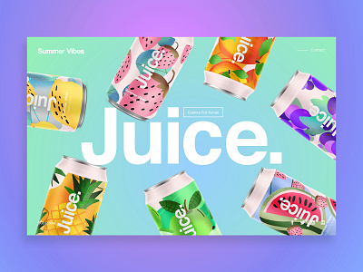
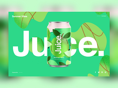
Another layout for the landing page of Juice. | Summer Vibes. I wanted to add abit more life into the can's with angles aroudn the brand name.
.
.
The brief is to express a fresh and fun feel to add to the taste. I have developed the look form the first round, adding abit more relation to the fruit/flavour but still keep the fun abstract feel.
Follow The Progress On Instagram
Follow ∆ Studio–JQ ∆
SkillShare Classes | Behance | Instagram | Twitter | Pinterest | Facebook | YouTube
All Works Copyright © 2019 ∆ Studio–JQ ∆
More by MadeByStudioJQ View profile
Like

