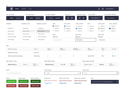
Product UI Guide
At TaxJar, our team of 80+ is 100% remote, so clear, intentional communication is key to ensure that everyone is on the same page about why, what, and how we're building new features.
As the only product designer on the team, a huge focus of my time is increasing the efficiency and accuracy of bringing an idea through the design => development => launched phases.
UI guides have played an instrumental role in handing off designs to developers, so we can effectively work asynchronously and minimize UI QA work prior to shipping a new feature.
This shot is an example of a UI guide that was put together and shared via Marvel with developers, so they could inspect and understand the granular interactions in the product while development.
This is just one of the many steps that we include in the product development lifecycle, and I'll continue to share more about how our team scales design across teams and time zones. Cheers!
