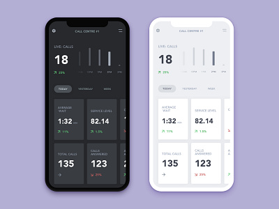
AgentQ mobile layout
Spent some time thinking through an idea I had for a mobile view for AgentQ, a product by Eyeonit.
The main focus was to keep the data large and easy to digest but still on one screen so the user can swipe horizontally rather than requiring a series of taps to find the metrics they need.
Added a little bit of night time / day time for comparison but I'm always a sucker for a dark interface.
More by Jesse Davies View profile
Like


