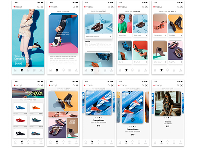
Macy's App Browsing Study
The result was a prototype that exuded simplicity and refinement, with clean lines and bold, vibrant accents that drew the eye to the most essential information. Its visual product descriptions, featuring high-quality images and videos that allowed customers to examine the product from all angles, were truly innovative.
But this prototype was about more than just its visual appeal. It also offered customers the ability to browse through user-generated content, including reviews, ratings, and photos of the product in use, providing them with a comprehensive understanding of the product and helping them to make informed purchasing decisions.
As I gazed upon this prototype, I knew that it had the potential to transform the way that customers interact with Macy's products. Its user-friendly interface, striking design, and transparent approach would surely bring joy and inspiration to customers all over the world.

