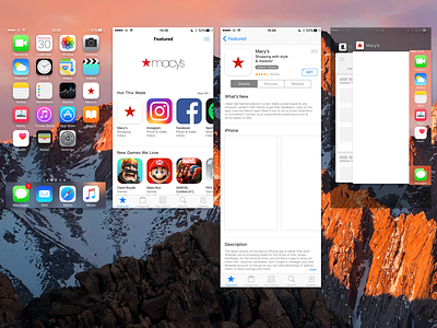
Macy's App icon redesign


The first step in the design process was to gather inspiration and do research on current trends in app icon design. We looked at a variety of different app icons and took note of the design elements that seemed to be working well for other companies.
Next, we brainstormed a variety of different concepts for the Macy's app icon. Some ideas included incorporating the classic Macy's red star, using a more abstract and minimalist approach, or incorporating iconic imagery from the Macy's brand such as the Macy's Thanksgiving Day Parade.
After discussing and refining the concepts, we created a series of rough sketches and mockups to present to the team. The team provided feedback and we continued to iterate on the designs until we landed on a final concept.
The final concept for the Macy's app icon featured a modern and minimalistic design, with the iconic Macy's red star as the main focus. The star was surrounded by a sleek and sophisticated black border, which gave the icon a high-end and luxurious feel.
We then moved on to the final design phase, where we fine-tuned the colors, fonts, and overall aesthetic of the icon. We worked closely with the development team to ensure that the icon would work seamlessly with the overall design of the app.
To ensure pixel perfection and compliance across all retina screens, we conducted thorough testing on various devices and screen resolutions to ensure the icon looked crisp and clear on all screens. Additionally, we followed the guidelines set by Apple and Google for app icons to ensure our icon met the necessary standards for the App Store and Google Play. Every detail, from the placement of the red star to the font choice, was carefully considered to ensure the icon was visually appealing and aligned with the Macy's brand. Overall, our attention to detail and commitment to pixel perfection resulted in a high-quality and visually stunning app icon that effectively represented the Macy's brand.
Finally, after several rounds of revisions and testing, the Macy's app icon redesign was complete. The new icon was sleek, modern, and perfectly captured the essence of the Macy's brand. We were all extremely proud of the final result and couldn't wait for our customers to see it in the App Store.
