Forth + Back Mailer 2019
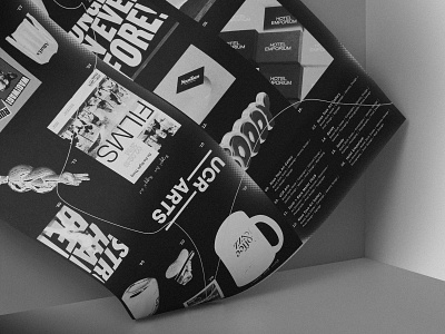
For Forth + Back’s 2019 mailer, the focus centered around the idea of showcasing the studio’s work in a “new light”. As a way to translate the design process, F+B allowed elements of the poster to be cut, flipped, and layered. The final black and white design was then inversed, letting the light become dark, and the dark become light. The resulting poster design was ultimately printed on black paper with white ink, which enabled the work to remain inversed all the way through the printing process.
