Chrome and Code Vol. 1 : Dawn
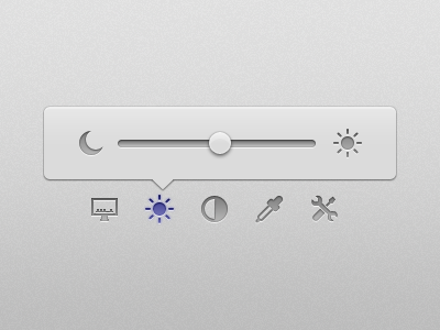
After a week's work, finally it's ready :
One of my greatest dissatisfaction with myself was that me as an user interface designer was only able to push dead pixels on screen. I could make a black navigation bar, a blue header, verbal buttons with three states or metaphorical icons for use in the interface but UI design consisted of much more than those dead pixels. Dead pixels adds to the overall visual appeal – the look of the UI – but in the end they are dead, having no life in them.
It was in that realm of 'feel' I found that the interface turned from just good looking to a great functional UI. It's the details of the app considered in a holistic manner, where even the subtlest of the animations contributes to a user's experience.
Mike Matas puts it best in this interview when he said that user interfaces should be emotional. Made By Sofa has mastered this craft and it can be seen in the new Facebook Camera application.
What I was doing till now was producing interfaces that were non-expressive and I continued to assign myself the label of user interface designer. But now, finally I can happily say that I have found a way to escape out of that hypocrisy. I am now able to set the look and then prototype the interactions of a complete application.
I think I am now one step closer to bringing the things I envision to life. Although, Bret Victor's argument still stands. I'm not a designer in it's all sense. But things are progressing on that end as well.
Feels so happy to level up from the world of gloss and gradients to the world of quadratic, cubic and, sinusoidal ins and outs. Hope you guys enjoy the result as much as I enjoyed the process.
An upcoming second part is in the making which contains a few touches that I think will make it truly unique.
Hat tip to @Bjango ✎ Marc Edwards on Skala Popover which I drew inspiration from.
