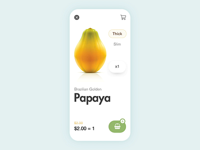
Fruit Store App
ADD TO CART - FRUIT STORE APP
Concept:
Haven't we had this awful moment of being aware of how distant are some shopping experiences in digital/online platforms vs. the real shopping experiences when buying some products?
Well, nowadays this is definitely a process that AR/AI/VR/MR and maybe other technologies are trying to help making more close and intimate to what a real shopping experience is. However, every possible design solution is making the count. I try to contribute from a very plain app design solution…
Speaking about the online/platform/app fruit shopping experience I found ripeness of each fruit is defiantly a very intimate personal not defined choosing moment.
The Solution:
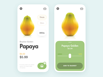
So I choose a fruit like PAPAYA (My favorite one) expecting to help with a user flow on an app when buying fruits by adding this important step(choosing ripeness) just previously to the ADD TO CART moment.
The reason I did this, at this specific moment was that however, fruits need to be bought with some specific ripeness previously chosen, this shouldn’t be a blocker to the product shop conversion. This way we could leave the user to just hit add to cart with no need to choose a specific ripeness state or to be as a mandatory step of the process.
Or maybe as a user is very important for you to choose the ripeness state and you could drag a simple button to see how the fruit goes from very ripe to very green with such excellent feedback on the screen by the micro-interaction
is in real life.
How do you like the visual? Share your feedback!
Press "L" to show some love!
Instagram | Linkedin | Behance | Tumblr | Medium


