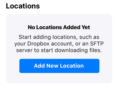
TOFileKit - No Locations Default Design
This is a follow-up shot to my last one. TOFileKit is an open source UI library I'm building to make it easier to download files from the internet into iOS apps.
Since my last shot, I've decided to change the visual style from the traditional one in iOS to the new visual style Apple has started using in apps like Music and the App Store.
The trend is apparently called "complexion reduction" with the overall look of reducing as much color variation as possible, and an emphasis on bold titles.
This ended up being more of a design challenge than I realised because you suddenly need to start worrying about the number of line separators you can use to visually separate content. It makes sense to put a line under every title and subtitle, but that's far too many.
One particular challenge is that when the UI is first shown, and the user hasn't had a chance to enter any of their accounts in yet, some kind of "on-boarding UI" is necessary.
It makes natural sense to center this content horizontally, but without putting a separator line underneath the header text, there's a visual disjoin between the header being left-aligned, and the on-boarding UI being centered.
Thankfully Apple already solved this problem in the Music app: use a rounded rectangle instead of a separator to isolate, and contain the centered content.
I'm having a fantastic time learning the design lanuage behind complexion reduction. I love its simplicity yet modern feeling, and as a developer, I also love how much more quickly it is to develop.

