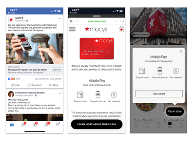
Macy's Mobile Pay Solution
As a seasoned designer with experience in transactional interaction design, I knew that this project would require a high level of attention to detail and a focus on people needs. I began by conducting extensive research to understand the needs and preferences of Macy's customers. This included interviews with shoppers, analysis of shopping data, and review of industry trends.
With this information in hand, I set out to design the mobile pay concept screens with the goal of creating a seamless and convenient shopping experience for Macy's customers. I started by designing a simple and intuitive interface that would allow shoppers to easily browse and purchase products using their mobile devices. To ensure that the screens were easy to use, I incorporated clear and concise instructions, as well as intuitive navigation elements.
I also focused on creating a secure payment system that would protect the personal and financial information of Macy's customers. This included implementing industry-standard encryption techniques and offering multiple payment options, such as credit card, debit card, and mobile wallet.
Throughout the design process, I worked closely with Macy's team to ensure that the mobile pay concept screens met the needs of the business and its customers. I also solicited feedback from test peoples to fine-tune the design and address any issues that arose.
Overall, I am proud of the work we did on the Macy's mobile pay concept screens, and I believe that it has significantly improved the shopping experience for Macy's customers. By leveraging my experience in transactional interaction design, I was able to create a people-friendly and secure mobile payment system that has helped to drive customer satisfaction and sales for Macy's.

