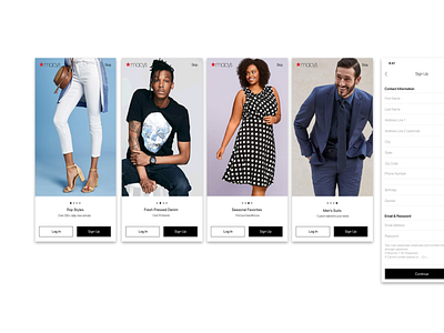
Login, Signup and Onboarding for Macy's mobile app
We started by conducting extensive user research to understand the needs and behaviors of our target audience. We interviewed current Macy's customers, as well as those who had never used the brand before, to get a sense of what they were looking for in a shopping app.
Based on our research, we knew that users wanted a fast and easy signup process, so we designed a simple form that only required a few pieces of information. We also added the option to sign up using social media accounts, which made it even faster and easier for users to get started.
For the login feature, we wanted to make it as seamless as possible, so we added a "Remember me" option that would allow users to stay logged in between sessions. We also implemented a "Forgot password" feature, which would allow users to reset their password if they forgot it.
For the onboarding process, we wanted to make sure that users were introduced to all of the features of the app in a way that was engaging and informative. We designed a series of screens that would walk users through each feature, highlighting the benefits and how to use them.
Overall, the process of designing the login, signup, and onboarding features for Macy's new iPhone app was a challenging but rewarding experience. By conducting thorough user research and designing with the user in mind, we were able to create a seamless and enjoyable experience for our users.

