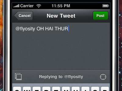
Beak for iPhone: New Tweet View
Implemented the design... the rounded box to type into didn't end up working right because [UIColor clearColor] as the textview's backgroundColor looks fine until you select text and the whole thing is white. Lame. I went with a more minimal design instead. The green Post button was darkened and is flatter than Mr. Max Voltar would like :)
More by Mike Rundle View profile
Like

