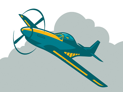
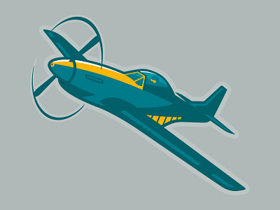
Aviator Mascot Part 2
I created this for fun. And because in this version the line work is actually all there. Subtle differences between this shot and this rebound. Also because I don't see enough rebounds. People post finished work too often, and I like to see sketches and process and improvement on this platform.
If I had my choice, I might have looked at a few alternatives for the color ways. In my opinion, these do look good. A teal and gold palette is appropriate for schools. I just think I might have tried a few different ones, and I might, on another rebound. Cheers!
More by Daren Guillory View profile
Like


