Publisher (Flat)

• Using orange in more places. Hmm, orange. Orange?
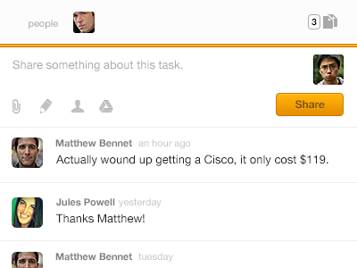
• Trying to minimize the use of depth on UI elements. Only seen on buttons and that poppy divider. Trying that and similar marks as a way of leading the eye through a hierarchy spread across the screen vertically and horizontally (2-pane collection/detail view)