Yamaha Music School - Original Proposal
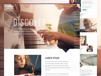
This was my original proposal for the Yamaha Music School project. Although, we ultimately went a different direction, I still really like this version. The photography style is so natural and warm – it creates so much authenticity. The addition of the line-art waves in each section convey movement, fluidity and motion. From a navigational standpoint, I like the simple, one-word headlines for each section which of course, are mirrored in the navigation. A very simple but effective landing environment.
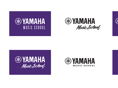
Comps show a responsive landing environment and proposed logo options.
Client-approved designs are shown here.
Please visit my portfolio (www.jeffmcallister.com) for detailed work.
More by Jeff McAllister View profile
Like


