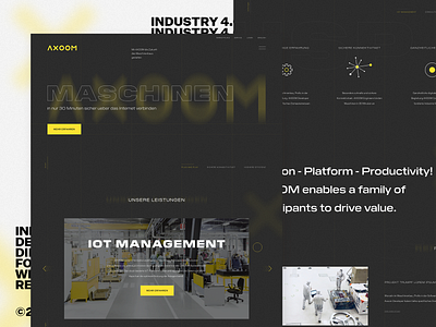
Industry 4.0 Company — Homepage Design Direction
In the beginning of this year we worked on a project for an Industry 4.0 company.
These were the first design directions and concepts for the homepage.
We decided to go with a bold, typography based layout. There are grid lines in the background guiding the user through the content and helping to tell the story of the product. To add more excitement and depth to the website we used different elements with a blur effect in the background which the user can interact with. As our primary typeface we used Untitled Sans — a modern, neutral grotesk and complemented it with Pilat Wide, which has a more technical and bold character.
You can find more of our projects on our behance account:
https://www.behance.net/dorfjungs
Cheers,
Norman
------
Dorfjungs. Online

