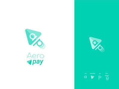
Redesign Aeropay Logo
Logo redesign for Aeropay company made for fun !
Using letters to translate the rewarding aspect : Put one coin in the slot ( "a" letter ) and you ll get more coins coming out ( "p" letter ).
Paperplane from their original logo has been simplified and can now be used as a mark, icon app ...
" Aero " is thin to translate the aerial aspect of the word, and " pay " is bold and italic to show how trustable and quick is to pay with Aeropay.
I hope you enjoy it, don't forget to press "L" !!
And follow me on Instagram !!
More by Merouane Bellaha View profile
Like
