Sigma Pi
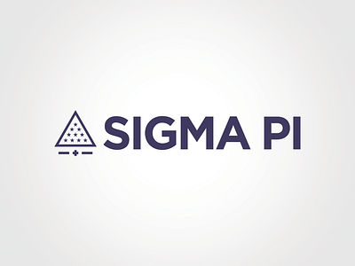
The newly redesigned Sigma Pi logomark is made up of two core components: the emblem and the wordmark.
The emblem takes key elements of the organization and creates a strong statement. The primary element of the emblem is the Radiant Triangle. The Greek cross is situated below the Radiant Triangle, with a line on either side. The two lines symbolize the unity of the Fraternity and Foundation in a contemporary sense, while paying homage to our founding organization Tau Phi Delta, as well as Delta Kappa, a fraternity that merged with Sigma Pi in 1964.
The main wordmark of Sigma Pi represents the strength and boldness of the Fraternity by using the Gotham typeface. The wordmark no longer includes “Fraternity, International” as a prominent element, allowing the Fraternity’s recognizable name to stand on its own. Additionally, dropping the secondary elements of the name allow this new logomark to represent both the Fraternity and the Foundation through the established shared direction for the betterment of the organization.