Senglobe Homepage
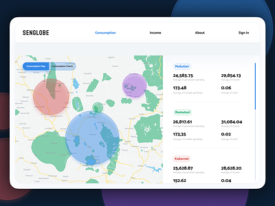
This is one of the older pieces of work that I decided to share. It's a dashboard that shows energy consumptions in given country by regions. There are two columns with two views, one is more visual with the map and circles that represent the amount of energy consumed and numerical values in the other column.
One more shot from this project coming at you a bit later, take care!