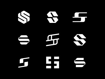
S Lettermark Exploration For Session
Exploring a few S lettermarks for a fitness app called Session. Can you pick your favorite? 🤔
Session is an upcoming app that will revolutionize
how people exercise. It will help you to be more productive
in your exercises. Better results in 20-30min sessions.
Workouts created using bodyweight exercises and
basic equipments only. You’ll be coached by an AI system
providing feedback so the app can adapt your workout plan in the process. Available on App Store and Android Store.
Services: Logo, App Icon and Applications.
Logo style: Lettermark
Audience: People concerned about health and fitness. Most in their 20s. Social media users. Also reach 30/40 year old people to prove they don’t need a gym to be healthy.
Brand attributes: Modern, Bold, Confident, Innovative, Movement
More about this project very soon 😃
-

