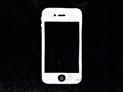
Organic Looking iPhone
I wind up using stock iPhone images in mockups, or articles for Cloud Magazine often. As much as I dig the form factor and design of that product, I get bored with using it in designs. So I made this little guy to take a break from the crisp and clean look that we're all used to.
This one accompanied a short article in the current issue of Cloud Magazine for 3 Must Have Productivity Apps. Enjoy!
More by Doug Penick View profile
Like
