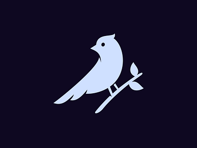
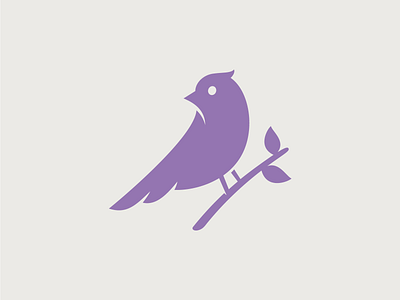
Unused Bird 2 – Improved
Though this logo is an unused concept, I'll never pass on the opportunity to improve it. Tweaks:
– Displayed the logo on a dark background, this makes the shadows more realistic. (Thanks @Adolfo Teixeira!)
– Improved the neck area so the bird doesn't look sad. (Thanks @Maarten Corpel)
– Moved the eye a bit, made the feather at the top a bit more cheeky, and tweaked the brand and legs a tiny bit.
Better? Yes or no?
More by Jord Riekwel View profile
Like


