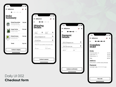
Checkout UI - Daily UI 002
Hello Dribbble,
The second day of the Daily UI Challenge is done. Today's theme was "checkout forms" so I designed the checkout process for a mobile store.
This was a very good use case for a step-by-step form that greatly improves user experience by asking the user for a few things at a time instead of overwhelming him with all the fields in one screen.
From a style perspective, I decided to go for a minimalist design because I started this as an app for a fictitious decorative plant store focused on minimalist and modern interior design.
You can also see the screens bettter on Instagram
Hope you enjoy it and don't forget to like and follow for more! :)
More by Alex Paul View profile
Like
