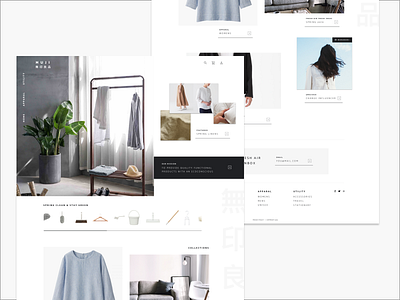
Minimalist UX
This is a self-motivated experiment in UX for a Japanese retail company called MUJI (無印良品).
A co-worker introduced me to their website and spoke highly of their products and mentioned the company recently started selling some of their products online. I wanted to evolve the layout to feel more current and pushed for the site to more closely align visually with the companies brand.
View on Behance https://bit.ly/2Eleg1b
More by Stephanie View profile
Like


