#Daily_UI 004 Calculator
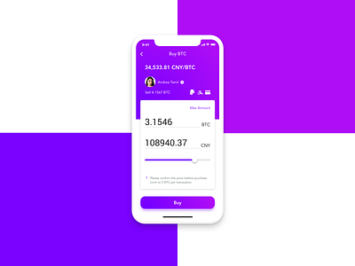
Today's purpose of UI practice is to try the blue purple color combination and redesign a screen of cryptocurrency trading platform from my previous project.
• Add a slider to "make it easier" for number changes (but I'm not sure since numbers are quite sensitive in this case )
• Use layers to separate "display information" from operation area
• Make numbers more obvious
Please feel free to leave me any comments and feedbacks!
More by Dongwan(Dora) Xie View profile
Like

