A Personal Touch
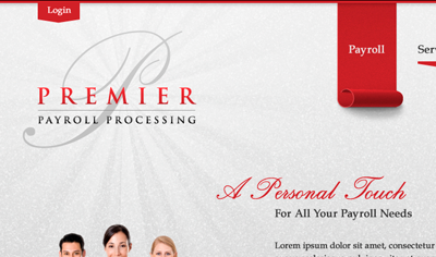
Thanks for the draft Cameron! This is what I'm working on at this very moment—deciding if the login tab is too distracting from the logo. I considered placing it near the nav on the right side, but it needs to be a focal point. I'm afraid it would it blend in with the current page highlight (carpet roll) if placed more to the right. Thoughts?
More by Jesh Barlow View profile
Like
